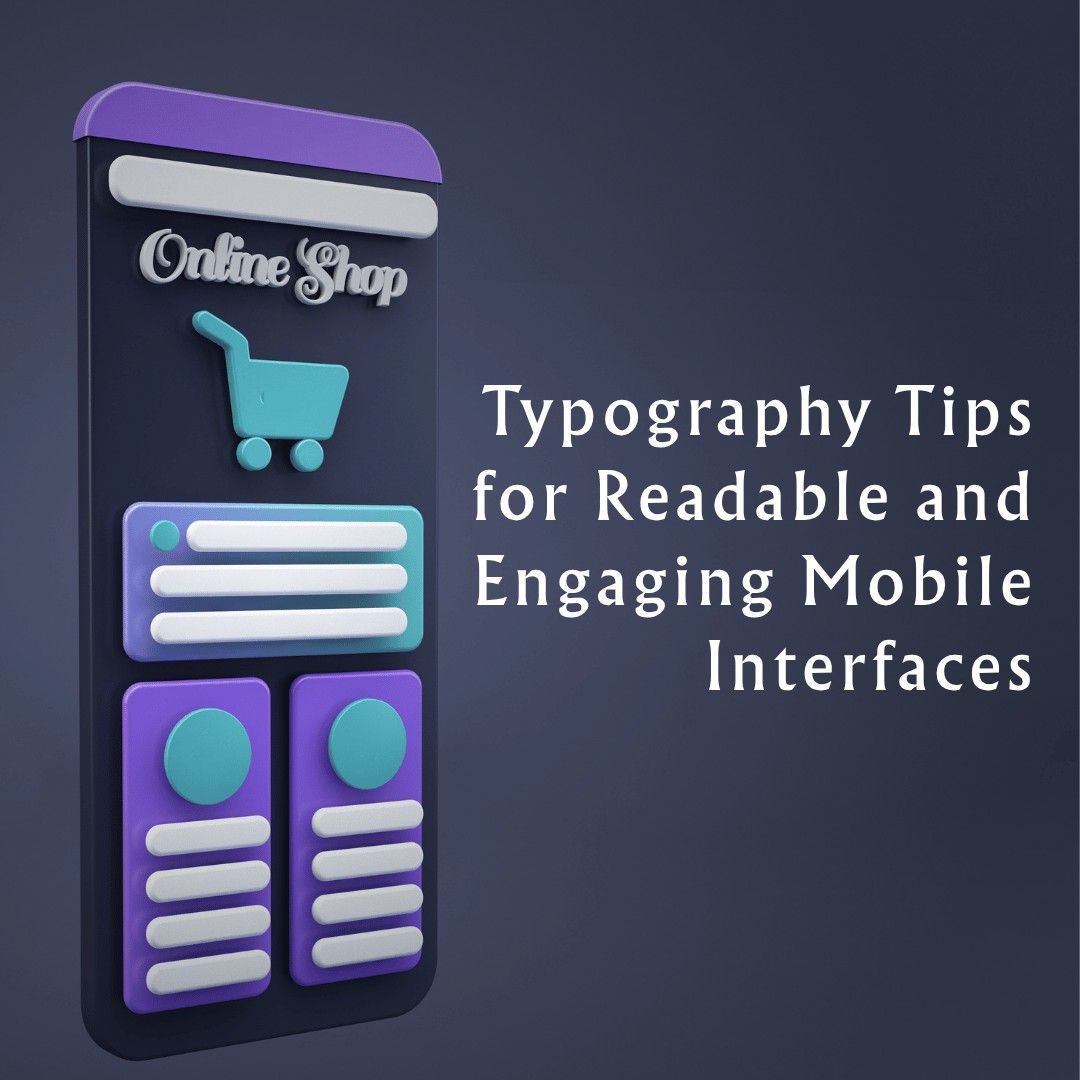
Typography Tips for Readable and Engaging Mobile Interfaces
Typography is one of the most fundamental yet often underappreciated elements in mobile application design. Although it is visuals and their interactivity that take the cake, most of the information that is loaded on any mobile app is presented as text. Having the right typographic decisions, the apps become readable, involving, reachable, and refined.
The Role of Typography in Mobile Interfaces
Typography is not simply the choice of font size the font type; it exists to communicate. In the context of mobile application design, it governs how information flows visually and cognitively across small screens. Compared to tablets or desktops, where websites are viewed, mobile apps are viewed on small screens, in different lighting settings, and most time, in the moving direction. Patterns involve the speed of scrolling, automatic taps, and instant decisions within a span of milliseconds. When your prose is costly to go through, when it is encased in its e-clutter, when it is not so well organized, you will instantly lose interest.
When creating a phone app, the primary goal of typography is to make the content easy to read and understand. This includes the choice of readable fonts, maintenance of the font size, proper spacing, and conformity with the user’s expectations. Typography becomes the blueprint that leads the users from screen to screen and action after action.
Choosing the Right Typeface
Which font to use may already predetermine the atmosphere and the behaviour of an app. Readability is the key in the design of mobile applications, and thus in most cases, the fonts used are serif-free fonts due to their clean and modern look. EVEN the simplest system font, e.g. Roboto, San Francisco, or Helvetica Neue, is not only neutral in appearance, but screen density and operating-system-specific rendering optimisations are also being applied. The fonts are quicker to load and scale adequately and compatibility is also not a real issue.
It is tempting to work in custom or branded fonts when developing a phone app but designers should ensure that custom fonts are well licensed and tested. They ought to excel in multiple dimensions, be compatible with all the languages that the application might use and not affect performance due to the introduction of a load time. Custom fonts may seem innovative, yet, they will not do in the event that they render it less responsive and readable.
Establishing a Visual Hierarchy
Visual hierarchy is a necessity in any design, only that on mobile design it is more important because the space at hand is limited and the time duration of attention is limited as well. In mobile application design, creating a clear hierarchy involves using font size, weight, color, and spacing to guide the user through the content.
The subheadings are employed to create a hierarchy which is, with the aid of which the users will be able to divide the content into manageable parts. Putting this hierarchy in place while creating a phone app will make it easier on the mind, which is good considering that in times, the user is doing many things at once, or wants to accomplish something within a short period of time.
As an example, we might take a heading 20-24pt, subheadings 16- 18pt, and the body text 14-16pt. But the size is not the only characteristic, font weight and font color can also be used to make contrast and attract attention to the places where it is needed. A solid hierarchy leads to faster reading, more retention, and general usability.
Spacing and Layout: Breathing Room for the Eyes
In mobile application design, cramped text makes reading difficult and uncomfortable. On the one hand, over-spaced text causes a bad flow of content and excessive scrolling. On mobile, the body text should have a recommended line height of approximately. 1.4 to 1.6 times of font size. This leaves space to breathe, but does not leave excessive white spaces.
When creating a phone app, developers and designers should also be careful with paragraph spacing. Blocks of writing should be visually separated and yet connected. Text containers should be padded to avoid crowding along the edges, and the tap targets should not be very close to each other. These spacing options are useful to avoid cases of fatigue, and users would go deeper into your content.
Contrast and Color Choices for Readability
The other major consideration related to mobile typography is contrast. Very contrasting ones, such as black text and white background, or vice versa, white text over dark background, do work well. Nevertheless, designers are to avoid extremes. In a case like this, a pure black background and pure white text may provide excessive glare in dark mode. Rather, they are a little dulled whites and blacks, which are better balanced.
Stay tuned for business tips, news and more
Every Monday, Wednesday and Friday

Responsive Typography and Accessibility
The pixel density ought to be figured out, the screen resolution, and availability options. The fonts have to flow and be responsive. When creating a phone app, failing to support dynamic text sizing can alienate users who rely on larger font settings due to visual impairment. With responsive typography, text elements will resize proportionally, and which will defy screen size, and yet retain a hierarchical order. Also, the inculcation of screen readers, proper naming of user interface objects, and clear indicators of visual focus all enhance a more inclusive design.
Typography in Dark Mode Interfaces
The dark theme is no longer the trend; it has become a normal aspect of a mobile app. It saves battery and computer users a lot of eye strain, even in low light, and it puts visual control into their hands. However, mobile application design in dark mode brings its typographic challenges. Dark text over black should not use white (#FFFFFF). This may be too contrasting that it puts eye strain.
Language Support and Localization
In case your mobile app has a global audience, then the typography you use should favor various structures of writing in distinct languages. This is a vital consideration in mobile application design, as different languages can significantly affect layout, spacing, and readability. In other such cases as Chinese or Japanese characters, they would need to be sized and spaced differently from the Latin-based scripts.
When creating a phone app that supports localization, choose fonts that include full Unicode support. Be sure that your design system takes into consideration such issues as text expansion-the saying can be twice as long in German or Russian as in the English version. At the design stage, adequate planning will avoid the instance of layout breakage and ensure a smooth experience among the different language groups.
The Impact of Typography on Brand Identity
Typography is not merely a matter of practice, but it has emotional substance. The typefaces you use and your style of typeface determine the perception of the users towards your app and your brand. In mobile application design, typography is one of the key elements that establishes tone and personality.
When creating a phone app, think of typography as part of your brand’s voice. It ought to correspond with the purpose of your app, with the expectations of your audience, as well as with your visual identity. The use of uniformity of the headings, buttons, and text gives confidence and efficiency. Irregular typography, however, makes your app look messy and disjointed, and makes it noisy.
Performance Considerations for Mobile Typography
Custom font and other advanced typography setups can make it look pretty, but could also impact on performance of the app. In mobile application design, file size matters. Very large font files may cause initial delays and affect performance severely in particularly on slow networks or on outdated devices.
Small file size: use necessary weights and character sets only. Fonts should be preloaded in cases where a layout shift or unstyled text flash (FOUT) could be a problem. It is part of a highly professional sensation of painless loading.
Microcopy and Functional Text
Not every typography is big and fancy. Microcopy can either break or make the use of your application. Microcopy involves such small texts that can be found in buttons, tooltips, error messages, and instructions. As a best practice in the design of mobile applications, microcopy must be limited, precise, and reference the language of the user (both literally and figuratively). It is anticipated to treat its customers in being aware of what is going on, what should be done, and how to go beyond any errors.
When creating a phone app, don’t neglect this “invisible text.” Make it always consistent, font sizes should be easily readable, le and it should stand out from otherwise fixed material. Effective microcopy brings about trust and keeps the users informed. Confusion and abandonment result when there is poor microcopy (or, even worse, no microcopy).
Typography as a Strategic Tool
It is about font choice and spacing, responsiveness, and localization of your app, and all typographic decisions are made to achieve overall success. Our goal is to make great typography that nobody will ever notice but which will simply work. It relaxes the users and helps retain their attention, and describes the quality of a professional brand. Give it the care and consideration you would the rest of your mobile application experience.