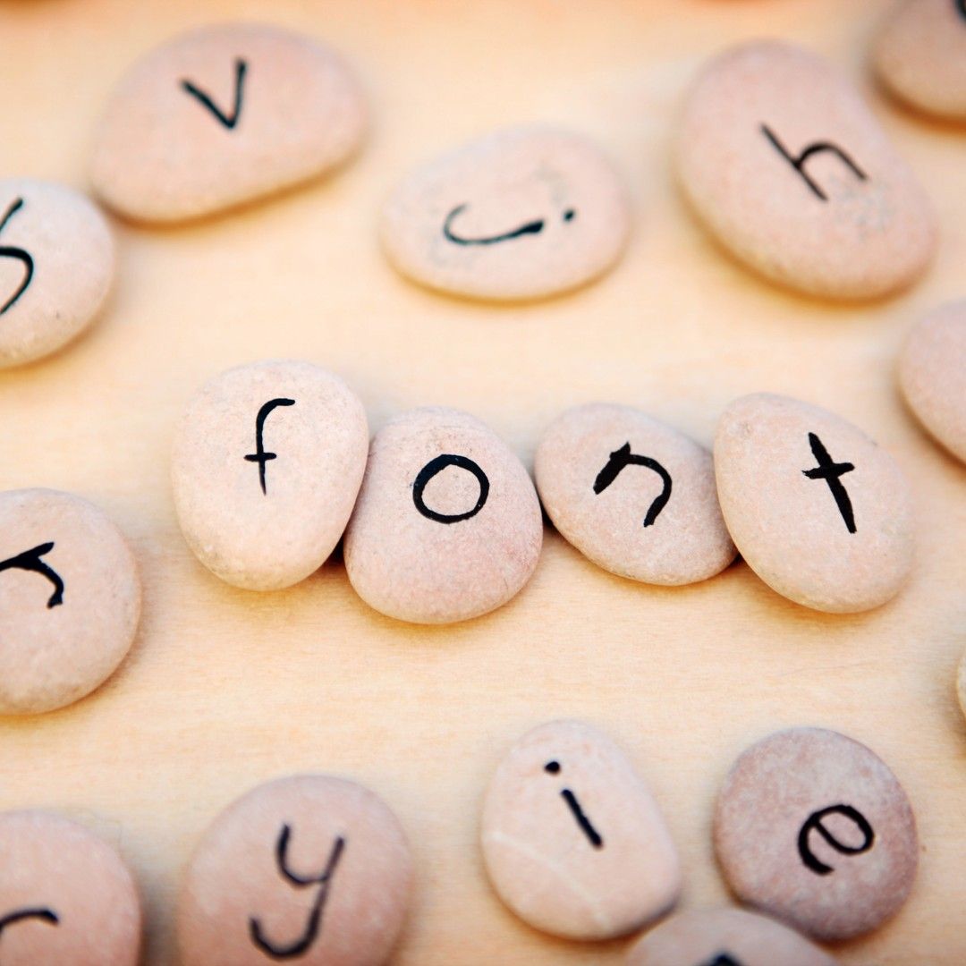
Tick-Tok Typography? The Fonts That Gen Z Clicks On
Within the fast-paced digi-vironment, both style elements and valuable content retain similar levels of importance. The alphabet becomes an emotional marker of identity for Gen Z members since it represents their personality and appearance to the world. Your choice of typography determines whether your message will be tolerable or legendary when adapting your content for e-commerce banners and Instagram carousels, and TikTok advertisements.
As a Bangalore graphic design agency, Digiworq understands that typography today isn’t just about readability—it’s about relatability. We should examine the style preferences of Gen Z while showing why your company requires awareness of their taste.
1. Bold Sans-Serif Fonts – Loud and Clear
Vibe: Confident, direct, high-impact
Best For: E-commerce banners, product launches, CTA-heavy ads
Statshow, Montserrat Extra Bold, and Anton, along with Impact, excel as attention-grabbing font choices. These designs possess thick strokes with clear geometry that enable them to attract immediate viewer attention through headlines and social networks, and promotional materials.
2. Handwritten Fonts – Human, Relatable, Artsy
Vibe: Personal, casual, expressive
Best For: Journals, brand storytelling, creative reels
Fonts such as Patrick Hand, Homemade Apple, or Shadows Into Light feel warm and informal. Their handwriting resemblance enables businesses to create authentic branding that Gen Z individuals appreciate because of their need to see transparency.
3. Serif Fonts with a Twist – Classic Meets Cool
Vibe: Sophisticated, editorial, retro-modern
Best For: Fashion labels, lifestyle blogs, Gen Z zines
Playfair Display, Cormorant Garamond, or Canela blend tradition with flair. Slightly embellished serifs of these fonts create a perfect combination for telling luxurious brand narratives that mix elite sophistication with contemporary panache in fashion-forward branding.
4. Retro Groovy Fonts – Funky and Feel-Good
Vibe: Fun, nostalgic, carefree
Best For: Apparel brands, creative TikTok, retro merch
The 60s and 70s psychedelic energy can be captured through fonts such as Cooper Black, Keep on Truckin’, and Genty in the recent Y2K design trends led by Gen Z. These fonts present their shapes in curvy chunks that bring optimistic, bright feelings to design.
5. Minimal Geometric Fonts – Clean but Trendy
Vibe: Sleek, futuristic, neutral
Best For: Tech brands, minimalist packaging, UI/UX design
Unity through symmetry drives the visual appeal of Poppins and Futura as well as Circular Std. The use of these types of fonts provides style without distraction while working for multiple modern design situations, including apps as well as branding applications.
If you’re the best graphic design company for building for upscale or slow-living brands, this is your lane.
6. Vaporwave Fonts – Aesthetic Meets Surrealism
Vibe: Dreamy, nostalgic, glitchy
Best For: Fashion edits, vaporwave-themed reels, music promos
Fonts like VCR OSD Mono, Sega Logo Font, or Cyberpunk channel late-80s tech with pastel gradients and digital distortions. VCR OSD Mono and its related fonts complement neon designs and checkerboard motifs and surreal color schemes preferred by Gen Z in micro-trend communities. The combination of retrofuturistic feeling with present-day trendy aspects makes these typefaces appealing.
7. Pixel & Arcade Fonts – Nostalgia Meets Gaming
Vibe: Playful, techy, nostalgic
Best For: NFT drops, indie games, meme merchandise
Three key fonts, including Press Start 2P, Pixeled, and Minecraftia, reproduce 8-bit and arcade fonts. These fonts work well because they create a retro appeal that appeals to Gen Z gamblers who enjoy both vintage console aesthetics and amusing nostalgia. These fonts are suitable for product naming and event posters, and digital collectible items seeking retro-cool aesthetics.
8. Neo-Brutalist Fonts – Raw, Grid-Locked, Disruptive
Vibe: Anti-design, ultra-modern, minimal
Best For: Editorial sites, bold social graphics, fashion brands
Three specific examples of fonts with hard edges are Editorial New alongside Söhne and Diatype which implement harsh kerning and no decorative elements. Gen Z chooses these particular fonts because they portray a “IDGAF” attitude which creates an unfinished yet purposeful design. This type of font excels best when it sits in open spaces featuring stark visual differences between elements.
9. Grunge & Distressed Fonts – Chaos, Texture, Rebellion
Vibe: Raw, rebellious, edgy
Best For: Band merch, underground events, protest art
The DIY/punk appearance of Grungy fonts arises through font choices such as Another Danger, Bleeding Cowboys, or Trajan Pro Distressed. Their reactions blend teenage anger with emotional behavior and disruptive tendencies, which align perfectly with youth advocacy and substance that seeks to depart from corporate cleanliness.
10. Bubble Fonts – Playful & Approachable
Vibe: Cute, childlike, meme-worthy
Best For: Snacks, comics, meme brands, kid-targeted apps
The fonts Baloo Bhai, together with Lilita One and Luckiest Guy, display a thick, bubbly, rounded appearance. These visually striking display fonts maintain readability under any device because of their strong yet comfortable texture. Their mirthful style contributes pleasantness and amiability to each piece of content.
11. Cyber Minimalist Fonts – Tech-Savvy, Futuristic
Vibe: Clean, futuristic, efficient
Best For: SaaS brands, crypto startups, Gen Z fintech
The fonts Orbitron and Exo 2 and Neuzeit Grotesk are particularly designed for digital interface use in digital domains. These typefaces work ideally with dark interface design elements and graphical glitches as well as visualized data layouts. For a Bangalore graphic design agency working with tech startups, these fonts signal innovation and clarity.
Stay tuned for business tips, news and more
Every Monday, Wednesday and Friday

12. Graffiti-Inspired Fonts – Street Meets Screen
Vibe: Urban, expressive, raw
Best For: Sneakers, music launches, youth events
Fonts under the names Urban Jungle, Tagster and BlowBrush reproduce spray painting effects and tagging along with hip-hop artistic energy. Youngsters who make up Gen Z show respect for streetwear style which matches perfectly with this distinctive visual language.
13. Aesthetic Cursive Fonts – Soft, Feminine, Journaling
Vibe: Elegant, vintage, diary-core
Best For: Journals, wellness content, romantic visuals
The text uses Parisienne along with Allura and Dancing Script to create the appearance of the “that girl” aesthetic, which represents a soft-focus look with latte art and skincare hauls. These font types function effectively both in carousel quotes and lifestyle reels and in feminine DTC brand packaging.
14. Collage/Textured Fonts – Mixed-Media and DIY
Vibe: Scrapbook-style, layered, artsy
Best For: Zine-style edits, Collages, alt fashion
Three fonts including Lombok, Bacana and Naïve Inline create a retro feeling through digital interfaces. Such typefaces imitate both cut-out text and layered ink textures which makes them suitable for creative storytelling, mixtures or independent campaign initiatives requiring a handcrafted aesthetic.
15. Monospaced Fonts – Retro Tech & Irony
Vibe: Minimalist, nerdy, retro
Best For: Code-themed content, memes, data design
The monospace fonts Courier New, IBM Plex Mono, and Space Mono pair perfectly with technical humor and minimalist memes while providing terminal-like visual attributes. Gen Z strongly responds to these fonts because they match their interest in clean, ironic internet-focused design.
16. Elegant Serif Fonts – Timeless, Premium
Vibe: Classic, luxurious, refined
Best For: High-end brands, luxury product promotions, wedding stationery
Luxury brands, together with premium design, choose elegant serif fonts Bodoni, Didot, or Georgia, because these fonts possess both sophistication and timelessness.
17. Modern Slab Serif Fonts – Strong Yet Stylish
Vibe: Bold, structured, edgy
Best For: Digital magazines, creative portfolios, tech companies
The contemporary approach of slab serifs includes Rockwell and Roboto Slab, and Bitter in their family tree. Slab serifs deliver power through their visual structure alongside a modern appearance, which works exceptionally well for contemporary digital content trying to stand out against time.
18. Script Fonts – Flowing and Artistic
Vibe: Artistic, fluid, romantic
Best For: Branding, beauty brands, signature-style logos
Script fonts like Great Vibes and Dancing Script, along with Pacific, provide a suitable choice for branding when you want elegant personal styling that suits beauty and lifestyle industries with a lavish handwritten aesthetic.
19. Industrial Fonts – Strong, Mechanical
Vibe: Rugged, utilitarian, bold
Best For: Manufacturing, construction, heavy industry
Bebas Neue and Industry, together with Neutrafac, provide brands in construction and manufacturing with a bold design that showcases authority and strength in their branding.
20. Condensed Fonts – Tight and Compact
Vibe: Modern, compact, utilitarian
Best For: High-density layouts, mobile-friendly designs, urban brands
The limited space area becomes optimally filled by condensed fonts Oswald, Impact, and Anton, which create a modern, slick appearance while remaining readable. The fonts function best when the spacing is restricted, since they maintain easy reading comprehension.
21. Geometric Sans-Serif Fonts – Clean, Modern
Vibe: Geometric, clean, contemporary
Best For: Tech startups, web design, futuristic branding
Three option fonts which provide serious and contemporary appeals include Avenir and Proxima Nova, and Circular. The distinctive straight lines in these fonts create an excellent match with technology or business websites that want to project a sophisticated, clean design.
Design That Feels Native to Gen Z
Gen Z viewers start their fast-scrolling motion immediately when they discover typefaces and visuals that do not mirror the visual sensibility of TikTok and Instagram platforms. The objective focuses on genuine comprehension of digital communication behavior before developing appropriate responses. A top graphic design company achieves success by converting your brand values into designs that align with modern aesthetics and cultural trends of youth-oriented digital platforms.
A Bangalore graphic agency does not describe Digiworq since we work within the spaces your audience inhabits and engages. Our company supports businesses of all kinds to attract Gen Z audiences by designing approaches which represent their changing tastes and communicate in their native language so they can create meaningful connections. Through our innovative perspective you will achieve both attention and powerful engagement of your brand.