The Global Rise of Indian Typography
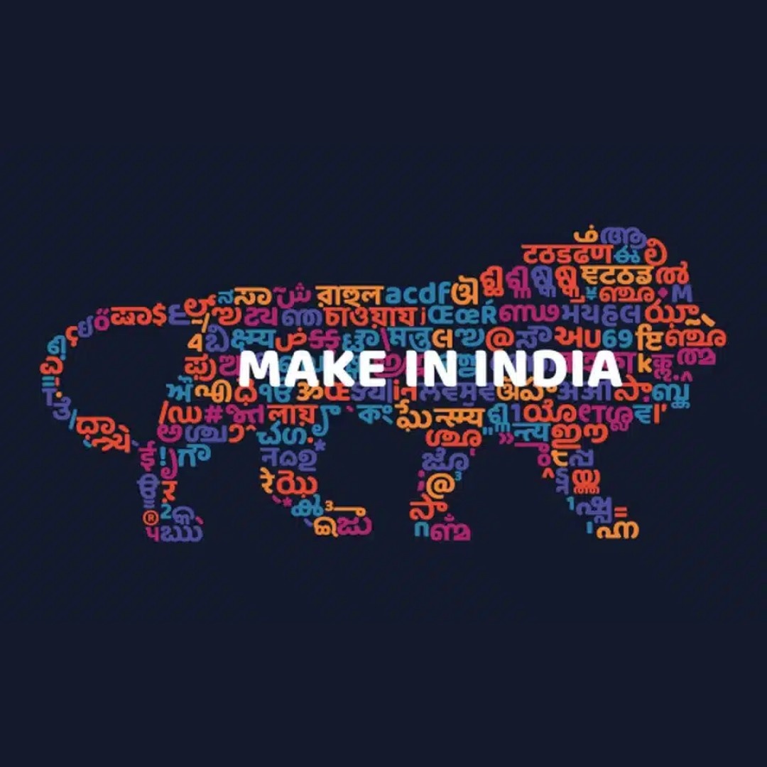
Designing in type is not a device to style anymore; it has become a force of humanity’s manifestation. It has been some years since Indian scripts could be seen on a global scale, and this represents a kind of change in the minds of brands and designers in associating language, identity, and emotions. Devanagari, Tamil, Malayalam, Gurmukhi, and a lot more scripts are being appreciated not only on the basis of being useful but also on their outlook, their aestheticism, and cultural morale. This emerging enthusiasm towards Indian typography is not a coincidence. It is based on digital inclusiveness, multilingual user interface, and an escalating need to be branded in a way that will appeal at a human and local level.
This move is an indicator of a broader phenomenon: the demand of authenticity and variety in the brand communication. With more internet penetration in regional India and the multi-language consumer making up the majority, design cannot be translated, it has to be entirely local with original type that becomes endemic and intimate.
From Helvetica to Harini: Breaking the Latin Monopoly
During the past decades Latin-based typefaces, such as Helvetica, Gotham, Futura, and Avenir have been used in the design world to a great extent. These fonts though clean and professional are silent to millions of users who do not use the Latin scripts as their main reading system. These fonts were never designed to support the linguistic requirements of users in India, Southeast Asia and sections of the Middle East and Africa.
Modern type foundries such as Ek Type, Indian Type Foundry, and Universal Thirst have contributed to the resurgence in Indian typography. These institutions have produced quality, type-savvy fonts in many Indian scripts, so that wise designers will no longer be forced to use the stop-gap measure of an image-based text or some default Unicode font. Designers are at hand to produce brands that are as local as it can be in terms of geography and language–letter by letter.
Language and Emotion: The Power of Native Scripts
The connection between language and trust is very strong emotionally. Once content is viewed in the mother tongue and recognizable loops and lines, it becomes much more personal. This is where typography is put to the forefront, not merely in the form of legibility, but rather in the form of emotional impact.
An example is when a Marathi-speaking user reads a site written in Devanagari and is intellectually connected in a way that the user would not have in English or in converted Latin script, which might not be well converted. A reader who speaks Tamil would feel misunderstood reading in a Tamil well-written font as compared to reading in a messed-up transliteration. This is not only about transmitting a message, but it is about passing along an intention of respect.
Such an emotional aspect of typography is vital in India where there are more than 20 official languages which are spoken in the country. An excellent design system must leave the people feeling witnessed, rather than being serviced. One of the most effective methods of establishing the connection is making use of native scripts with considerate typography.
The Craft Behind Typographic Identities
Designing powerful typography in Indian scripts is an engineering task and a design task. Many Indian script fonts are in their infancy and many are still being finalized unlike LATIN faces with long history of digital optimization. The complicating factors that designers should take into account when developing with such fonts are the changeability of line height, the configurativeness of scripts, the adjustability of font weight, and browser and device similarity.
Designers research the behavior of scripts within the digital environment so as to create efficient systems of branding. How does a specific Tamil font perform on devices with low resolution? Does Devanagari typeface have sufficient weights to make it hierarchical? Is it possible to compact Malayalam, preserving its legibility? Those are the technical questions that determine the success of a design in use.
Proper typography mixes between looks and utility. It makes sure that beauty does not come at the expense of functionality and that regional scripts receive the same level of design accuracy previously available only in Latin-based systems.
Global Designers Are Now Looking East
Indian typography is no more regional–it is more aspirational all the time. Global designers and brands are starting to adopt elements of the Indianscriptg as an element of beauty and conceptualism. Even the fashion labels, food wrapping, editorial spreads, and even museum installations utilize Indian form of letters to depict craftsmanship, genuineness and heritage.
It is not tokenism in culture-it is a thing of design development. The emotional character of Indian writing is contrasted to the strict severity of minimalist Western design, with the provision of a new and emotionally intense idea. The fluid sound of Malayalam, the solid geometry of Tamil, or the classy shapes of Bengali are all fair games of exploration.
With the elimination of narrative style brand marketing responses to change and the increasing importance of brand stories consisting of origin, purpose, and cultural detail, Indian typography has been utilized in storytelling across the world.
Stay tuned for business tips, news and more
Every Monday, Wednesday and Friday

Font Pairing Examples That Work
Designing and coming up with multi lingual design systems requires serious font matching. Similarly to using of serif and sans-serif types in English, designers have to take into account the interaction of Indian and Latin fonts when there is an Indian or Latin typography used within a bilingual or trilingual layout.
In the case of editorial work or blogs, Yatra One (Devanagari), on Libre Baskerville, makes a beautiful combination that feels artisan and made by hand. In the case of a contemporary tech commodity (and when both Hindi and English languages are used, Mukta complements Inter in a very lovely manner that gives clean lines and varied weights. Teko is bold; when used on youth audiences, it blends well with Montserrat and maintains the content youthful but still readable.
Catamaran is an advantage to the Tamil projects and when used with Source Sans Pro, results in a steady and enjoyable reading experience. The combinations are not just randomly chosen, they are put to test on aesthetics combined with balancing them, contrasts and legibility on different devices.
Multilingual font pairing belongs to system-wide branding and cannot be implemented as an afterthought, but as one of the first things in design.
Designing for Scale in a Multilingual World
Indian typography idea: Designing with Indian typography is not merely a decision and act of the art form, but a business decision. A uniform multilingual design system is necessary for companies whose operations extend to various geographical locations. Consider an OTT streaming platform that would provide content in Hindi, Tamil, Telugu, and English. The user who changes languages should not create the impression that he or she has gotten in other applications.
X Design systems built using well-scaled typography make transitions easy, promote UI hierarchy, and improve usability. Designers take into account such variables as vertical rhythm between scripts, fallback font functionality, and differences between line spacing. Speed also matters; in low-bandwidth areas, font should be fast enough, as well as in other areas.
Scalability of typography refers to being mindful of growth. What will work in two languages should translate graciously to five or more. A flexible typographic system makes product, marketing, and communication consistent.
When Typography Becomes Strategy
Typography is there to be strategic, as opposed to decorative. Your fonts have some impact on the perceptions held of your brand by your audience. An expensive brand can never afford to hang system fonts that do not render well on 50 percent of its users. An inclusive campaign needs to be respectful in the sense that it has to be designed in language rather than translated following machine logic.
Typography is more than a practical decision in India, it represents an inclusive, empathetic and culturally literate gesture. Those brands that take the time and effort to invest in typography specific to the region win the trust and loyalty. They demonstrate that not only are they addressing the audiences but also talking to the audiences.
Besides, this strategy aids the achievement of larger objectives such as making it available, digital equity, and brand recall. Typography should be considered a long-term asset and is used to form the way a brand is recalled and believed in.
Conclusion: Say It in Every Script That Matters
High typography is the key to brand voice. With the Indian scripts going global, it could be a requirement to align the visual language of brands with the users from all perspectives, including linguistic, emotive, and cultural. Proper choice of fonts is not only a matter of beauty; it is respect, connection, and strategy.
Through careful planning and execution, there has been a possibility that brands can create identities that speak outinf different languages without the loss of coherence and character. Good typography is no longer an option in the multilingual world because the best way to be heard is the easiest way to be understood.